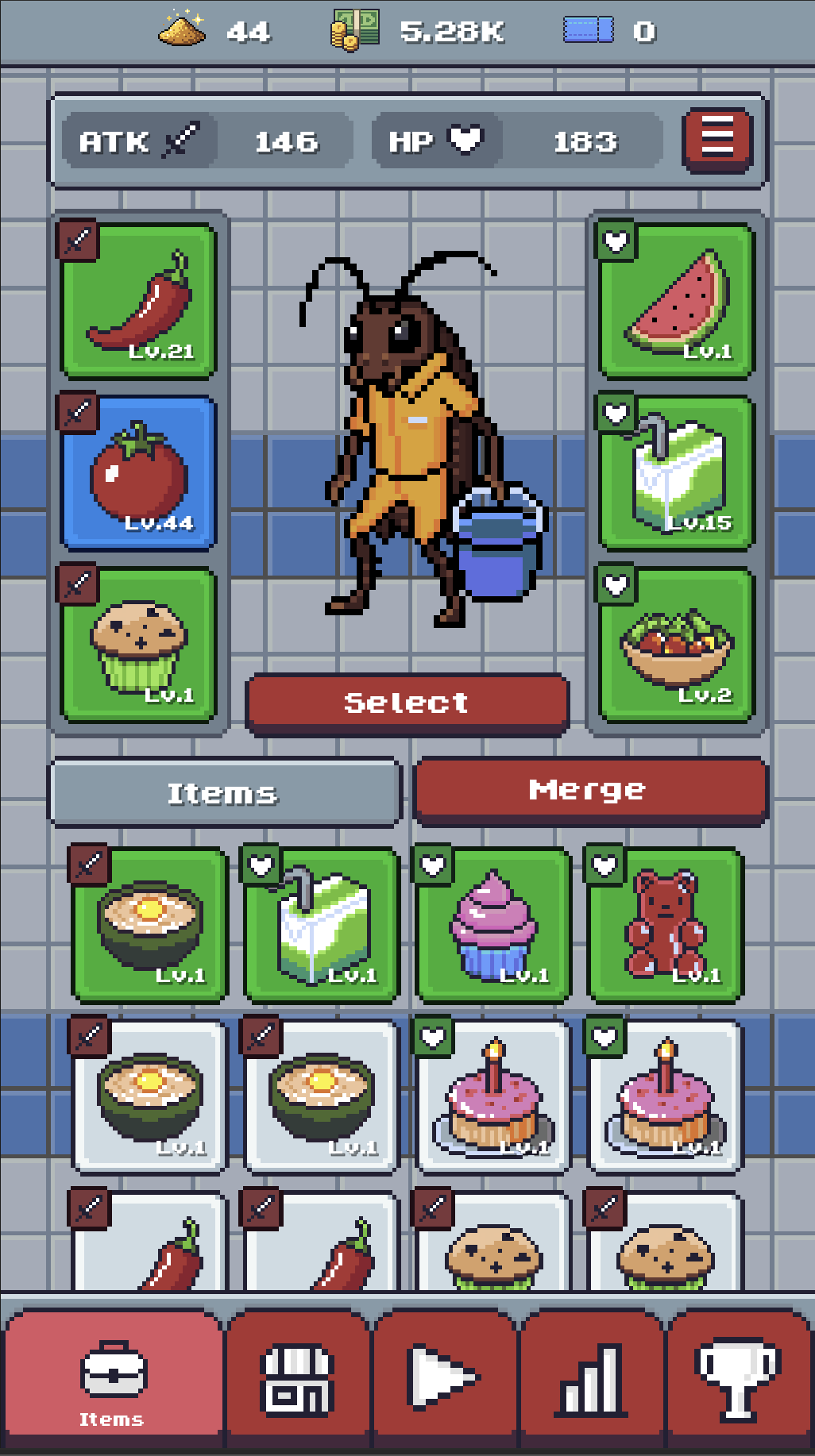
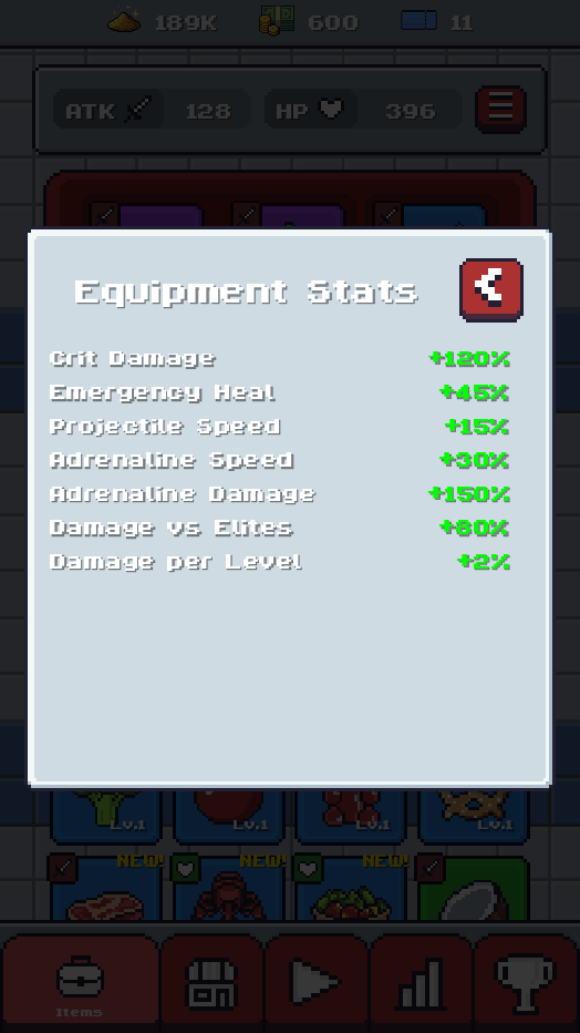
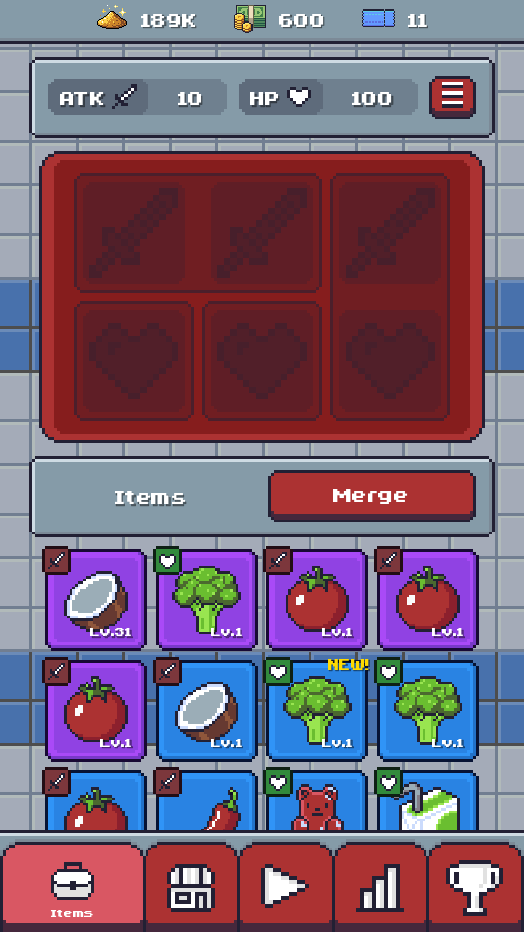
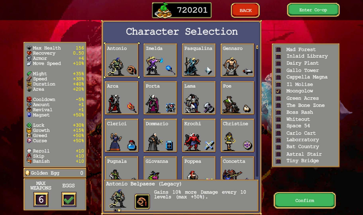
Case study / Sweeper Sinclair

Sweeper Sinclair app icon

Designing for Mobile

01 / The problem

Stats with no source of truth

The information players needed was scattered, partial, and out of context.

Details about character stats were spread across different UI screens, and each screen only told part of the story. Most only showed an increase or decrease value, never the full picture.

Stats needed to be unified into a single location that brought together base stats, character stats, and equipment stats, so players could understand the impact of an equipment or character choice in the context of the values it was modifying. A "+15% Might" number means nothing if you can't see the Might it is changing.

The gap was sharpest at character selection. The effects a character had on ATK or HP were never surfaced in the UI, even though that choice happens right inside the moment-to-moment "play game" flow, when the decision matters most.

Sweeper Sinclair equipment stats panel

Equipment stats

Only displays the stats of equipped items.

Sweeper Sinclair inventory and merge screen

Inventory / merge

Character-stat effects on ATK and HP weren't surfaced in the UI, even though character selection happens inside the play-game flow.

Sweeper Sinclair gameplay screen with the Play button

Gameplay

Sweeper Sinclair Choose Your Character screen

Choose character

Only shows increase/decrease values. No base stats or equipment modifiers are shown from the character selection screen.

Sweeper Sinclair Select Level screen

Select level

02 / Finding a solution

Solving the problem

Working within a portrait screen, and learning from how the genre solves the same job.

One of the constraints of designing for mobile is screen real estate. Sweeper Sinclair's portrait orientation limits the horizontal space available for communicating information, space that landscape games in the same genre don't have to worry about.

To find a layout that worked, I looked at how three comparable titles solve the same job, on phones and off, and what each one gets right and wrong.

Vampire Survivors character selection screen with full stat list

Vampire Survivors

Landscape / multi-platform

A dedicated PowerUp screen increases stat potency, and an exhaustive list of stats is shown during character selection. Passive effects are calculated and combined in the same panel. Passives are labelled, but a character's starting ability is only communicated through a texture.

Take: one panel as the source of truth for every stat.

Megabonk in-run stats display

Megabonk

Landscape / PC

Characters share the same pattern of a starting ability plus a passive that modifies stats at runtime. Here, stats are shown during gameplay, because players obtain modifiers mid-run. Since the values change dynamically, it makes sense to communicate them during a run rather than before it.

Take: show dynamic modifiers at the point in which they change.

Archero equipment and talents screens

Archero

Portrait / mobile

The closest match: a portrait mobile game with the same equipment, merge-based gacha system. It has the same weakness, no exhaustive stat list in one place, but it folds character selection into the equipment screen, housing equipment and character stats together while removing a step from the play flow.

Take: merge selection into equipment to cut a step and co-locate stats.

03 / The solution

One screen to rule them all

One place for every stat, shown in context, reached in fewer steps.

The fix needed a single source of truth for every stat modifier, paired with an exhaustive list of stats. Vampire Survivors and Megabonk proved the value of one source of truth; Archero showed how to structure where those modifiers come from on a portrait screen.

That turned into three moves: build one screen that shows every stat, fold character selection into the equipment screen to cut a step, and surface each character's modifiers at the moment of choice.

Sweeper Sinclair unified Stats screen listing every stat

One source of truth

A single Stats screen lists every stat, base values and modifiers together, so players have one place they can trust.

Sweeper Sinclair equipment screen with character select folded in

Fewer steps

Character selection folds into the equipment screen, co-locating the two biggest sources of stat change and removing a step before a run.

Sweeper Sinclair character selection showing each character's stat modifiers

Modifiers in context

Each character now shows its actual stat effects and starting abilities at the point of choice, not just a vague increase or decrease.

04 / Impact

Final Result

Stats are the spine of a roguelike. When players can't see how their choices change their character, every system downstream gets harder to understand and easier to abandon. Player and usability testing surfaced that players had no understanding of how all the stats worked together.

The impact shows up in the structure of the flow. Three partial, scattered stat displays became one source of truth. Character selection folded into the equipment screen, removing a step before every run. And each character's real modifiers now surface at the point of choice.

Treating it as a research problem rather than a layout problem meant the solution came from evidence and not taste alone. The genre had already tested these patterns, and the work was deciding which survive contact with a portrait screen.