
Case study / PikPok / Rival Stars Horse Racing
Store Page Design
A store page is an interface with one job. This is how I designed, tested, and iterated the storefront for Rival Stars Horse Racing to a 16% lift in conversion rate.
01 / The constraint
Five seconds to earn a download
A store page is UX under the harshest constraints in mobile: an icon at thumbnail size, two screenshots above the fold, copy nobody reads past the first line, and a visitor who decides in seconds. Every element has to carry meaning, and every meaning has to be tested against what players actually do.
(rebuilding from memory)
02 / Research
Know the rider before the race
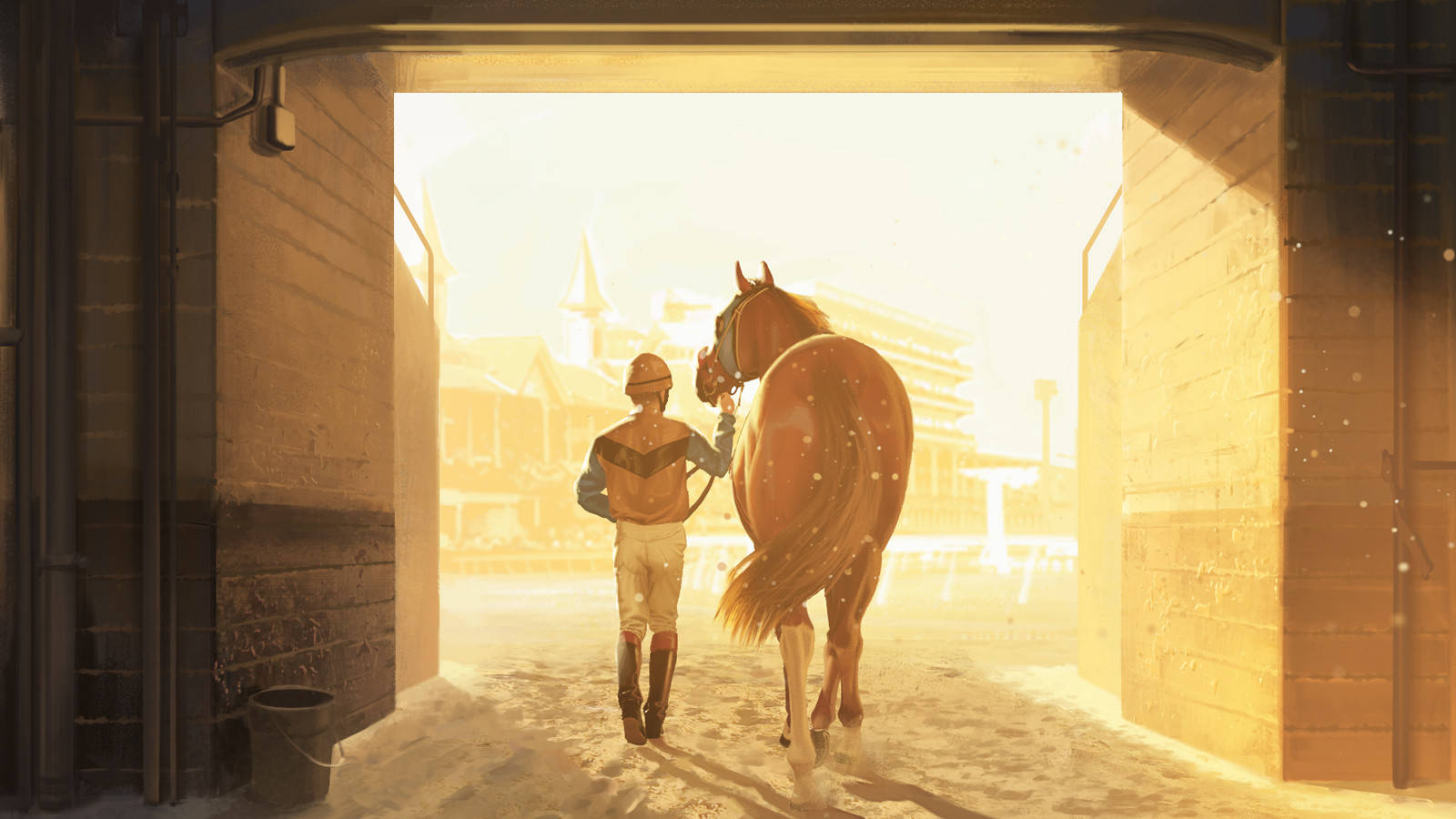
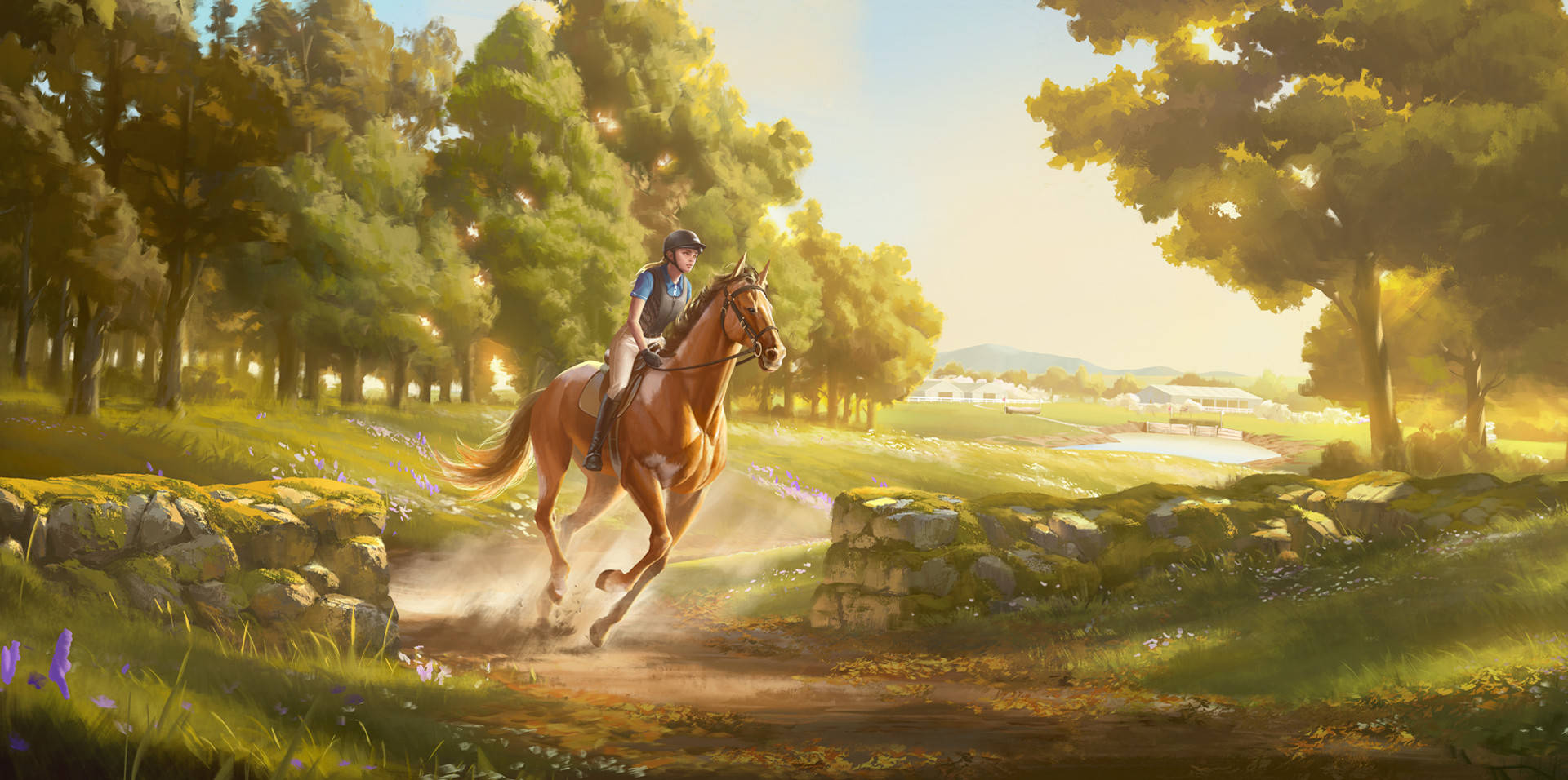
- Defined the audience beyond the genre: horse lifestyle communities, not just racing game players, validated through an influencer campaign that returned 300% ROI.
- Mined live store data and player reviews for what mattered to converting visitors: the bond with the horse, breeding and care, and home ranch life over pure racing.
- Turned insights into testable hypotheses about which imagery, words, and screenshot order would convert each audience segment.
(rebuilding from memory)
03 / The design
Structure, messaging, direction
- Designed the page structure and screenshot order: which moments appear above the fold, what each frame must communicate, and the narrative the sequence tells.
- Wrote the messaging hierarchy and store copy, leading with the fantasy players told us they cared about.
- Designed mockups and briefs for every asset: icon directions, screenshot framing, and capsule art, with final assets crafted by PikPok's artists to those briefs.
(rebuilding from memory)
04 / Test & iterate
Let the players decide
- Designed A/B test sets from live store data: icons, screenshots, keywords, and video previews, each test isolating one variable with a clear hypothesis.
- Read results back into the next design round, compounding small wins across icon, imagery, and copy over months of iteration.
- Applied the same loop when the franchise expanded to Desktop and Meta Quest, adapting page design to each platform's audience.
(rebuilding from memory)
05 / The result
Designed, tested, proven
16%
lift in store conversion rate
300%
ROI on audience-led influencer campaign
3
platforms: mobile, desktop, and VR
This page is being rebuilt from memory as a retrospective: the flows, mockups, and test designs are reconstructions of work originally created at PikPok. The process and the results are real.